
At Ravencliff Residence in western North Carolina, Plaster by Orciani ran Venetian plaster across the public rooms in our suede finish, an irregular shine-and-matte combination of lime and marble dust, hand-burnished to the right amount of polish so the room reads the wall, not the other way around.
The finish in plain language
Most articles about Venetian plaster lead with the textbook description: lime and marble dust, six burnish passes, a wall that holds light like polished stone. That version exists, and we build it when a project calls for it. But the majority of the Venetian work that leaves a PBO crew looks different from the textbook, and the difference is intentional.
The principal craft variable across our Venetian portfolio is the amount of polishing. Color shifts from project to project, and composition stays in a narrow band. What changes meaningfully, room to room, is how far we take the burnish. The suede finish is where we stop early on purpose: an irregular sheen across the plane, some areas catching light like satin while others hold matte. Read across a wall, the surface looks more like fine suede or aged limestone than polished marble.
This is the finish we deliver more often than the high-polish variant. It is not a compromise or a value-engineered version. It is a finish chosen because most residential interiors do not want a wall that performs. They want a wall that grounds the room.
The Ravencliff anchor
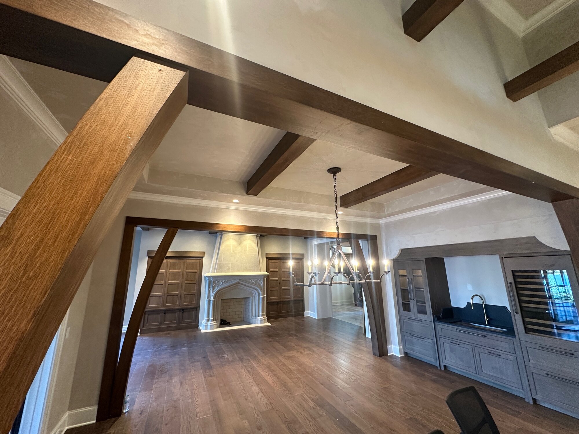
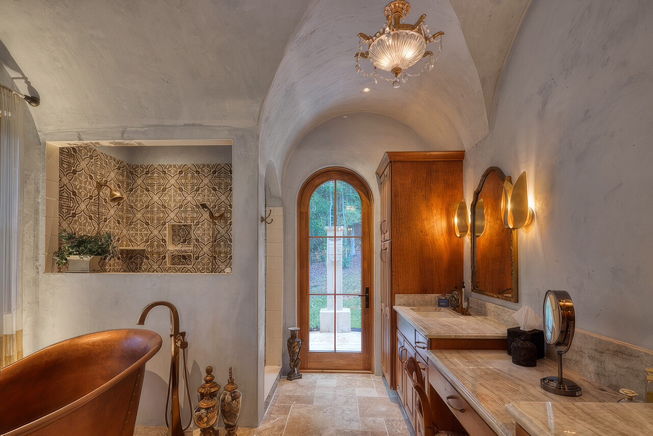
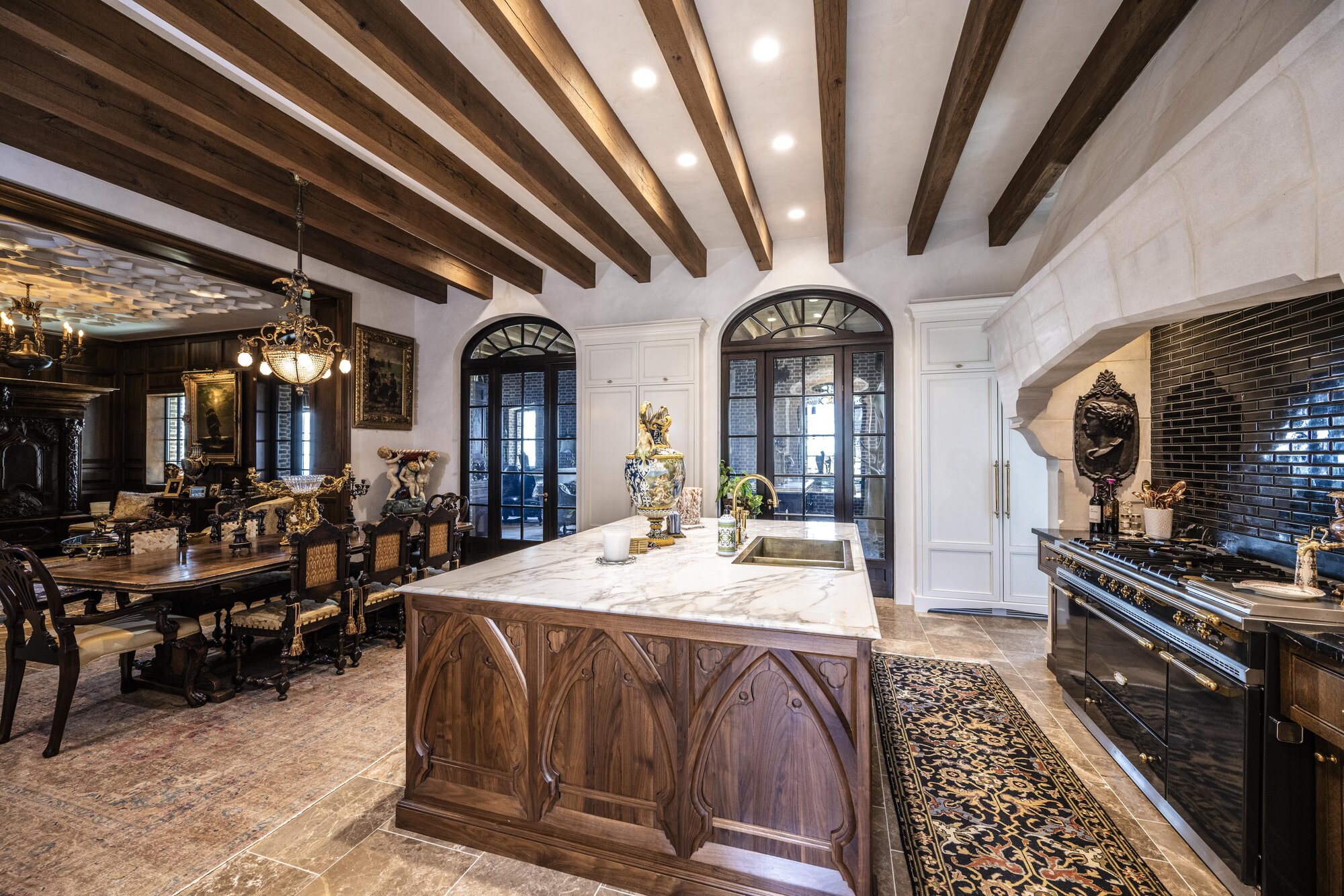
Ravencliff is a private residence in the mountains of western North Carolina. The public rooms (kitchen, primary living spaces, the rooms photographed by Danny Gale for the studio’s documentation) carry Venetian plaster in the suede finish. The architectural language of the house is stone, dark beamed wood, and gothic openings framed against open ground. The plaster had to sit alongside those elements without competing with them.
A high-polish Venetian would have done the wrong work there. A bright mirror reading from the wall would have flattened the relationship between the cream plane and the dark beams overhead, and it would have thrown the room’s natural light back into the room instead of holding it. The suede finish was the right specification across the public rooms: cream tuned warm enough to belong to the wood, cool enough not to drift yellow under the mountain light.
The walls catch the morning sun on one face and hold matte across the opposite face at the same hour, and through the day the trade-off moves quietly across the room. The signature documentation frame is the kitchen elevation, where cream Venetian plaster meets dark wood beams overhead, with the surface reading as polished stone at close range and as a quiet plane at distance. At the gothic openings, the wall registers as continuous with the architecture rather than as a finish wrapped around it. Suede plaster carries through a doorway better than a high-polish does, because the irregular sheen does not put a hard reflection at the threshold. The eye reads the opening as cut from the same material as the wall.
Photography is by Danny Gale across the project. The brief from the studio was to document the work as it lives in the room (in raking light, at distance and at close range) so the suede finish reads correctly in the frame. For the full set, see the Ravencliff project page.
Material and method
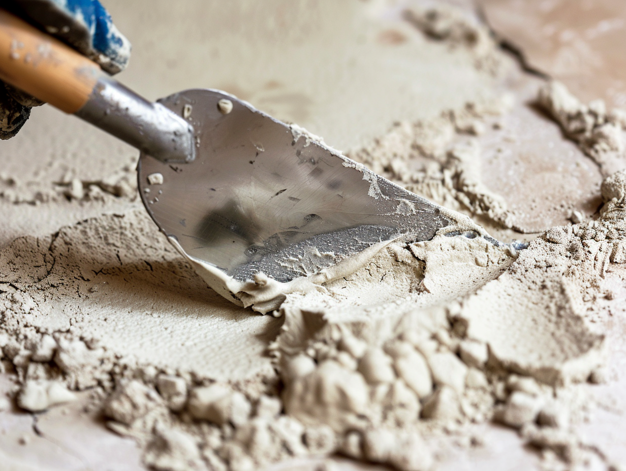
The composition starts with aged lime putty as the binder, slaked and stored long enough that the calcium hydroxide has fully matured. Marble dust is the aggregate, sourced at a fineness around 200 mesh for the body coats and finer still for the top coat. Mineral pigment is dispersed in water and folded into the lime before tinting passes. No acrylic binders in the base material, and no film-forming additives that would seal the surface against the slow carbonation that gives lime its eventual hardness.
This composition is steady across our Venetian work. What changes from project to project is the trowel used, the angle of application, and (above all) the number of burnish passes we walk across the finish coat.
We treat the burnish step as the design lever. Two passes leaves the surface predominantly matte with occasional catches where the trowel naturally compressed the lime. Three to four passes is the suede finish, which is what we ran at Ravencliff: irregular shine and matte combination, the trowel pattern visible as a soft cloud rather than as a directional stroke, the wall reading as a mineral plane that breathes with the room’s light. Five to six passes pushes the surface into the conventional mid- to high-specular Venetian, the polished-stone reading most people picture when they hear the word. We name the target on the sample board before production. The pass count is not a guess made on the wall.
On at least one project in the broader portfolio, the design called for maximum movement in the surface (visible directional energy, the kind of texture that catches sidelight and announces itself across a room). For that wall the crew worked with small steel trowels through the finish coat, deliberately leaving the handwork legible: less burnish, more texture. The result reads almost like a worked stone face. It is the loudest version of our Venetian and the one we recommend least often. In the right room it is the only correct answer, but Ravencliff was not that room. The public rooms there asked for the suede.
For cure and sealing: the wall is hand-touched at twenty-four hours, and calcium carbonation continues over weeks. On most residential interiors we leave the plaster unsealed so the lime can keep doing its work and the surface stays breathable. In wet rooms or near a range, we may brush a thin coat of natural wax or a microcrystalline finish, applied sparingly and buffed back so the surface does not film over. A sealant on a suede finish has to be even more restrained than on a polished Venetian, because any film at all will fight the irregular sheen we built in.
Where it works, where it does not
The suede finish is the right specification for most residential interiors: entry halls, living rooms, dining rooms, primary bedrooms, libraries, hallways, and kitchens of the Ravencliff kind where the plaster sits with heavier architectural elements. Anywhere you want the wall to hold weight without becoming the subject. The irregular sheen reads as quiet under most lighting conditions and stays handsome under all of them. It also forgives an old house or a heavy-massing new one. A suede finish on a wall with a little wave in the substrate looks intentional, because every imperfection in the plane shows up in a polished reflection and disappears under matte.
The more polished variant earns its place in specific rooms: smaller powder rooms where you want the surface to lift the room’s available light, Italianate dining rooms or bar areas where the design language is explicitly classical, certain hospitality interiors where the wall is meant to carry that reading. The small-trowel maximum-movement variant earns its place when the architect and designer are deliberately specifying texture as a design element, not a side effect.
Venetian does not belong in wet rooms with sustained standing water (showers, steam rooms); tadelakt is the answer there. It is not an exterior finish either. Lime stuccos and exterior marmorino cover that scope. Surfaces that flex (some new wood paneling, certain temporary partitions) will telegraph movement through the plaster regardless of how careful the application is. If the wall moves, the finish cracks.
A climate note: western North Carolina cures well because humidity sits in a usable range most of the year, with the seasonal swing predictable enough to schedule against. In Central Florida summer humidity slows the schedule. The lime is forgiving until it is not, and pushing a burnish too soon in damp conditions can flash the surface and lock in a hazy plane that has to be cut back and refinished.
What to write into the spec
A Venetian plaster spec that holds names the finish, the polish target, the substrate, the sample-board procedure, and the sealing direction. In a line: Venetian plaster, lime and marble dust, hand-applied; polish target suede finish (irregular sheen, three to four burnish passes) unless otherwise noted; high-polish or maximum-movement small-trowel variant by exception, with a sample-board reference; substrate two-coat veneer plaster over blue board, or properly skimmed drywall with the finish trade coordinating prep; minimum three sample boards at sixteen by sixteen inches, reviewed under the room’s actual lighting conditions and signed by architect or designer before production; sealing per applicator’s recommendation by room.
The spec sheet is shorter than this article. The walk-through and the sample-board approval do the rest of the work. The drawing exists so everyone downstream understands what they are buying, and so the polish target is decided on a sample in the room’s actual light rather than on the wall after the crew has already set up.
The most common misconception
Most clients arrive at the project assuming Venetian means high-gloss, because that is the image the word has carried in design press for thirty years. The reality across our portfolio is the opposite. The suede finish is what most rooms want and what most rooms get, and the polished variant earns its place by exception. When a designer hears “Venetian” and pictures a wet-stone mirror, the conversation we have early is the one that names suede as the default and polish as a deliberate choice for the rooms that truly want it.
The Ravencliff suede finish is one application of one variable in the studio’s Venetian vocabulary. The next room asks its own questions. Start with a conversation. Contact the studio.